


使用 HTML + JavaScript 实现 IDE 风格的拖拽调整布局功能(附源码地址)
<div class="toolbar"> <div class="menu"> <div>文件</div> <div>编辑</div> <div>视图</div> <div>调试</div> </div></div>
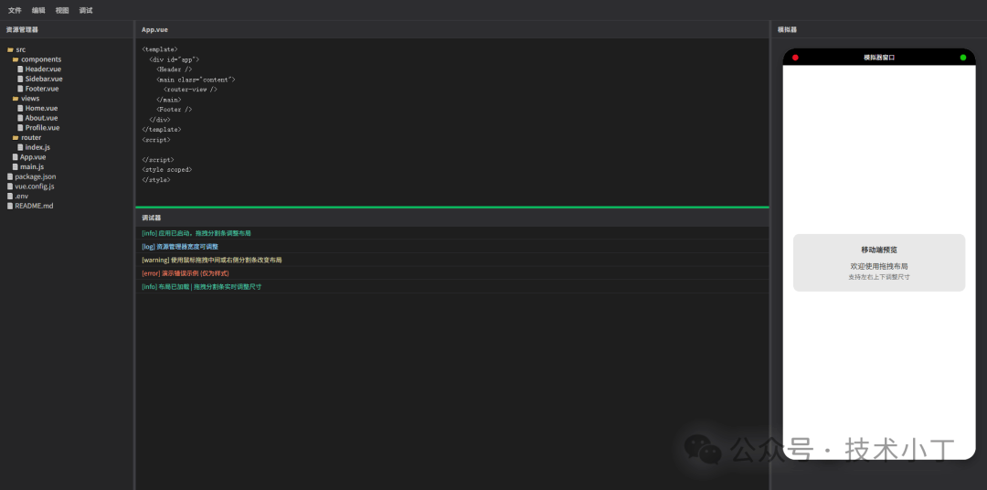
<div class="left-panel" id="leftPanel"> <div class="panel-header">资源管理器</div> <div class="panel-content"> <ul class="file-tree"> <!-- 文件列表项 --> </ul> </div></div>
<div class="middle-panel" id="middlePanel"> <div class="middle-top" id="middleTop"> <div class="panel-header">App.vue</div> <textarea class="panel-content code-editor" id="codeEditor"></textarea> </div> <div class="resizer-horizontal" id="middleResizer"></div> <div class="middle-bottom" id="middleBottom"> <div class="panel-header">调试器</div> <div class="panel-content console-log" id="consoleContent"></div> </div></div>
<div class="right-panel" id="rightPanel"> <div class="panel-header">模拟器</div> <div class="panel-content" style="padding: 8px;"> <div class="simulator-container"> <!-- 模拟器内容 --> </div> </div></div>
<div class="resizer-vertical" id="leftResizer"></div><div class="resizer-vertical" id="rightResizer"></div>
.workspace 占据了除工具栏外的所有剩余空间。内部的 .top-area 再次使用横向 Flex 布局,将左、中、右三个面板串联起来。分割条被赋予了特定的 cursor 样式(col-resize 或 row-resize),并在悬停或激活状态下改变背景色,为用户提供明确的视觉反馈。MIN_LEFT_WIDTH(最小宽度)和 MAX_LEFT_RATIO(最大宽度占父容器的比例)。这能防止用户将面板拖得太小导致内容无法阅读,或者拖得太大挤占其他区域的空间。leftResizer 上按下鼠标时,系统会记录当前的鼠标横坐标 startXLeft 以及左侧面板的初始宽度 startLeftWidth。在 mousemove 事件中,我们通过计算鼠标当前位置与起始位置的差值 deltaX,得出新的宽度值。但直接赋值是不够的,我们必须进行边界校验。这里有一个关键的计算逻辑:新宽度不能超过“父容器总宽度减去右侧面板宽度、分割条宽度以及中间面板最小保留宽度”后的剩余空间。let isDraggingLeft = false;let startXLeft = 0;let startLeftWidth = 0;leftResizer.addEventListener('mousedown', (e) => { e.preventDefault(); isDraggingLeft = true; startXLeft = e.clientX; startLeftWidth = leftPanel.getBoundingClientRect().width; document.body.style.cursor = 'col-resize'; leftResizer.classList.add('active'); document.body.style.userSelect = 'none'; document.addEventListener('mousemove', onMouseMoveLeft); document.addEventListener('mouseup', onMouseUpLeft);});function onMouseMoveLeft(e) { if (!isDraggingLeft) return; const deltaX = e.clientX - startXLeft; let newWidth = startLeftWidth + deltaX; const parentWidth = getParentWidth(); const rightWidth = rightPanel.getBoundingClientRect().width; const resizersTotalWidth = 8; const minMiddleWidth = 120; const maxLeftByLayout = parentWidth - rightWidth - resizersTotalWidth - minMiddleWidth; const maxLeftByRatio = parentWidth * MAX_LEFT_RATIO; const maxAllowed = Math.min(maxLeftByLayout, maxLeftByRatio); newWidth = Math.max(MIN_LEFT_WIDTH, Math.min(newWidth, maxAllowed)); if (newWidth >= MIN_LEFT_WIDTH && newWidth <= maxAllowed) { leftPanel.style.width = newWidth + 'px'; }}function onMouseUpLeft() { isDraggingLeft = false; document.body.style.cursor = ''; leftResizer.classList.remove('active'); document.body.style.userSelect = ''; document.removeEventListener('mousemove', onMouseMoveLeft); document.removeEventListener('mouseup', onMouseUpLeft);}
右侧面板的拖拽逻辑与左侧类似,但方向相反。当用户向左拖动右侧分割条时,右侧面板的宽度应当增加;向右拖动时,宽度减小。因此,在计算 deltaX 时,我们使用 startXRight - e.clientX。
同样地,我们需要确保右侧面板变宽时,不会导致中间面板的宽度小于预设的最小值 minMiddleWidth。这种相互制约的逻辑保证了布局的健壮性。
let isDraggingRight = false;let startXRight = 0;let startRightWidth = 0;rightResizer.addEventListener('mousedown', (e) => { e.preventDefault(); isDraggingRight = true; startXRight = e.clientX; startRightWidth = rightPanel.getBoundingClientRect().width; document.body.style.cursor = 'col-resize'; rightResizer.classList.add('active'); document.body.style.userSelect = 'none'; document.addEventListener('mousemove', onMouseMoveRight); document.addEventListener('mouseup', onMouseUpRight);});function onMouseMoveRight(e) { if (!isDraggingRight) return; const deltaX = startXRight - e.clientX; let newWidth = startRightWidth + deltaX; const parentWidth = getParentWidth(); const leftWidth = leftPanel.getBoundingClientRect().width; const resizersTotalWidth = 8; const minMiddleWidth = 120; const maxRightByLayout = parentWidth - leftWidth - resizersTotalWidth - minMiddleWidth; const maxRightByRatio = parentWidth * MAX_RIGHT_RATIO; const maxAllowed = Math.min(maxRightByLayout, maxRightByRatio); newWidth = Math.max(MIN_RIGHT_WIDTH, Math.min(newWidth, maxAllowed)); if (newWidth >= MIN_RIGHT_WIDTH && newWidth <= maxAllowed) { rightPanel.style.width = newWidth + 'px'; }}
中间区域的高度调整涉及纵向布局。与宽度调整不同,这里我们关注的是 middleBottom(调试器)的高度变化。当用户向下拖动水平分割条时,调试器的高度增加,编辑器的高度相应减小。
在 onMouseMoveMiddleBottom 函数中,我们计算垂直方向的位移 deltaY。限制条件包括:调试器的最小高度 MIN_MIDDLE_BOTTOM_HEIGHT,以及为了保证编辑器至少有 minMiddleTopHeight 的空间,调试器最大不能超过 middleHeight - minMiddleTopHeight。
let isDraggingMiddleBottom = false;let startYMiddleBottom = 0;let startMiddleBottomHeight = 0;middleResizer.addEventListener('mousedown', (e) => { e.preventDefault(); isDraggingMiddleBottom = true; startYMiddleBottom = e.clientY; startMiddleBottomHeight = middleBottom.getBoundingClientRect().height; document.body.style.cursor = 'row-resize'; middleResizer.classList.add('active'); document.body.style.userSelect = 'none'; document.addEventListener('mousemove', onMouseMoveMiddleBottom); document.addEventListener('mouseup', onMouseUpMiddleBottom);});function onMouseMoveMiddleBottom(e) { if (!isDraggingMiddleBottom) return; const deltaY = startYMiddleBottom - e.clientY; let newHeight = startMiddleBottomHeight + deltaY; const middleHeight = getMiddleHeight(); const minMiddleTopHeight = 150; const maxMiddleBottomHeight = middleHeight - minMiddleTopHeight; const maxByRatio = middleHeight * MAX_MIDDLE_BOTTOM_RATIO; const maxAllowed = Math.min(maxMiddleBottomHeight, maxByRatio); newHeight = Math.max(MIN_MIDDLE_BOTTOM_HEIGHT, Math.min(newHeight, maxAllowed)); if (newHeight >= MIN_MIDDLE_BOTTOM_HEIGHT && newHeight <= maxAllowed) { middleBottom.style.height = newHeight + 'px'; }}
在实际使用中,用户可能会缩小浏览器窗口。如果窗口缩小的幅度很大,原本合理的左右面板宽度之和可能会超过新的窗口宽度,导致中间面板被完全挤压消失。为了解决这个问题,我们监听了 window 的 resize 事件。
在 adjustLayoutOnResize 函数中,我们重新计算中间面板的理论宽度。如果发现其小于最小阈值 MIN_MIDDLE,程序会自动从右侧面板(优先)或左侧面板中扣除相应的宽度,以“保护”中间核心工作区的可见性。这种防御性编程极大地提升了用户体验。
function adjustLayoutOnResize() { const parentWidth = getParentWidth(); const leftWidth = leftPanel.getBoundingClientRect().width; const rightWidth = rightPanel.getBoundingClientRect().width; const resizersWidth = 8; const middleWidth = parentWidth - leftWidth - rightWidth - resizersWidth; const MIN_MIDDLE = 120; if (middleWidth < MIN_MIDDLE) { const shortage = MIN_MIDDLE - middleWidth; let newRightWidth = rightWidth - shortage; const minRight = MIN_RIGHT_WIDTH; if (newRightWidth >= minRight) { rightPanel.style.width = newRightWidth + 'px'; } else { let newLeftWidth = leftWidth - (shortage - (rightWidth - minRight)); newLeftWidth = Math.max(MIN_LEFT_WIDTH, newLeftWidth); leftPanel.style.width = newLeftWidth + 'px'; rightPanel.style.width = minRight + 'px'; } } const maxLeft = parentWidth * MAX_LEFT_RATIO; if (leftWidth > maxLeft) { leftPanel.style.width = maxLeft + 'px'; } const maxRight = parentWidth * MAX_RIGHT_RATIO; if (rightWidth > maxRight) { rightPanel.style.width = maxRight + 'px'; }}// 处理resize事件let resizeTimer;window.addEventListener('resize', () => { if (resizeTimer) clearTimeout(resizeTimer); resizeTimer = setTimeout(() => { adjustLayoutOnResize(); const currentMiddleBottomH = middleBottom.getBoundingClientRect().height; const middleH = getMiddleHeight(); const maxMiddleBottom = middleH - 150; const maxByRatio = middleH * MAX_MIDDLE_BOTTOM_RATIO; const maxAllowed = Math.min(maxMiddleBottom, maxByRatio); if (currentMiddleBottomH > maxAllowed && maxAllowed >= MIN_MIDDLE_BOTTOM_HEIGHT) { middleBottom.style.height = maxAllowed + 'px'; } if (currentMiddleBottomH < MIN_MIDDLE_BOTTOM_HEIGHT) { middleBottom.style.height = MIN_MIDDLE_BOTTOM_HEIGHT + 'px'; } }, 100);});
阅读原文:https://mp.weixin.qq.com/s/2Zgs6EzqTKGNVCmogG7ZbQ